FOLLOW/SUPPORT
![]()
![]()
![]()
![]()
CONTACT: [email protected]
![]() JOIN THE MAILING LIST
JOIN THE MAILING LIST
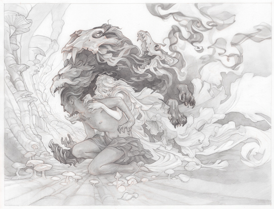
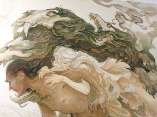
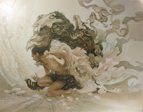
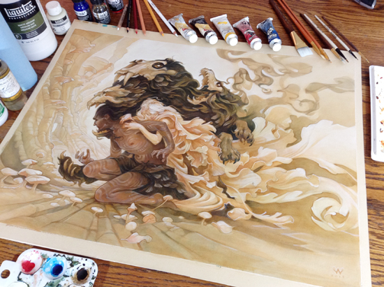
TAM LIN
Oil Painting Process
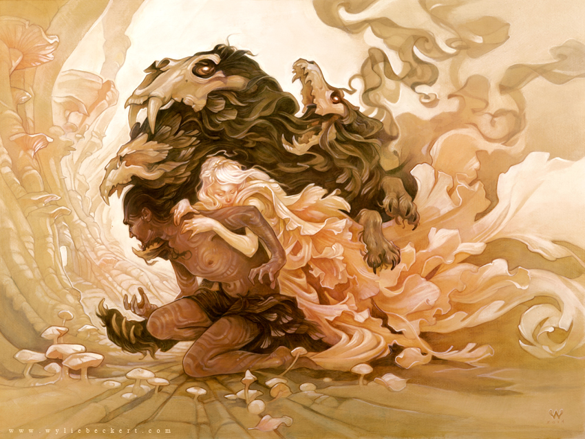
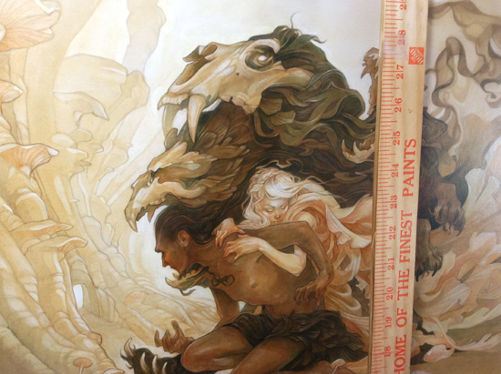
18" x 24" Mixed media (acrylic, colored pencil, and oil) on illustration board.
I am a pathological recycler, especially when it comes to art. While it's always exciting to tackle a new idea, the amount of planning I like to put into the early stages of an image can make the process prohibitively time-consuming for personal work (which is always a struggle to squeeze in among the projects that pay the rent). Revisiting my older work strikes a nice balance - I get to apply new skills, knowledge, and media to a piece without the looming uncertainty that comes with planning a whole new concept from the ground up.
This painting is one such recycled idea. My original take on the Tam Lin legend was a small toned paper drawing; I ended up tackling the new version in acrylic and oils, and on a much larger scale (around 18x24".)
AND! I filmed the painting process for this piece, so I'm thrilled to be able to direct you to my very first clumsily executed art process video. Check it out to see 40 hours of painstaking labor condensed into 20 frenzied minutes... You've been warned.
Before I get to the tutorial, I want to mention that all of my process tutorials are made possible by my patrons on Patreon. Your support helps keep the tutorials coming - you can lend a dollar or two to the cause at the link below!
the concept
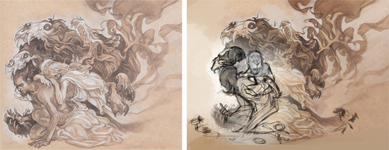
The initial sketch (left) and some digital revisions (right).
The great thing about reworking an older piece is that many of the hard design decisions are already made for you. My first painting was working pretty well on the whole; but, since I didn't want to paint the exact same image twice (can you imagine anything more tedious?), I made a few minor changes.
I tweaked the poses of both characters and the bear skull, scaled the wolf down to a more reasonable size, and started thinking about a more detailled environment for the scene. I sketched these revisions digitally over my original pencil drawing, printed the new sketch at full size, and used a lightbox to transfer the important details to a sheet of Bristol paper.
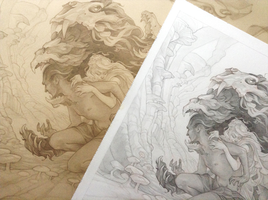
the pencil art
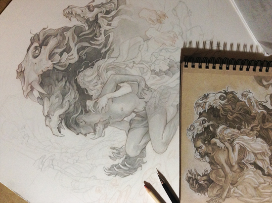
I used a brown Col-Erase pencil for the initial image transfer; the marks that these pencils leave are quite faint and don't erase as easily as standard graphite, making them ideal for laying down a rough sketch that can later be worked over and refined in pencil. You can see the underlying Col-Erase sketch in the unfinished wolf paw in the snapshot above.
For me, the pencil drawing is the most important stage of an image. I'll spend a great deal of time getting the pencil art just right - a little over 20 hours in this case, about a quarter of which is spent reworking faces and hands, which are often hard to get right the first time. I take my own photo reference as I go to double-check poses and anatomy, and to keep the image grounded in reality.
(Materials: Strathmore Bristol; brown Col-Erase pencil; various HB pencils; kneaded erasers & eraser pencils.)
Finished pencil art (16 x 21.5" pencil on bristol.)
the white charcoal underdrawing
The original pencil drawing (right) on top of the print reproduction on tinted paper (left).
After spending tens of hours on a pencil drawing, the last thing I want to do is paint over it. A print of the pencil art preserves the original, as well as offering some freedom to resize or crop the image; I don't have my own large-scale printer, but fortunately I live near a print shop that does oversize giclee printing. I used tinted pastel paper for this print, and wet mounted it to illustration board so I'd have a sturdy surface to support the layers of paint (I use a process similar to Donato Giancola's method.)
I started the rendering process with white charcoal pencil - fleshing out the volumes and adding highlights and fine details. Over the course of the painting, a lot of this white charcoal work ended up hidden by the subsequent layers of ink and paint, but I still found it helpful to audition the final values in an erasable medium before moving on to paint. For future paintings I'll probably substitute acrylic ink, which has a bit more staying power, at this stage.
(Materials: Canson Mi-Teintes paper in Oyster, Strathmore 500 heavyweight illustration board, white charcoal pencils).
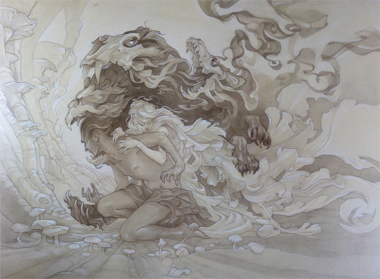
The finished underdrawing.
the underpainting
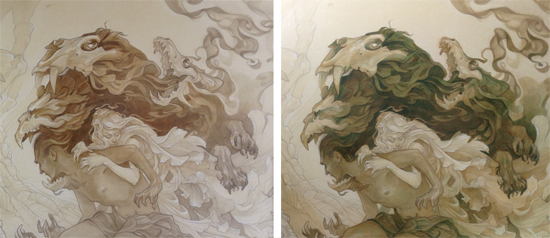
I sealed my white charcoal drawing with spray fixative and a coat of matte medium, then began to build up the values in acrylic ink. I started with raw umber to create a monochromatic underpainting, then went over this with some greenish tones (a mix of raw umber and phthalo blue) to deepen the darkest values and add contrast.
What you see above is actually my SECOND acrylic underpainting. It turns out that acrylic ink, while more stable than watercolor, doesn't bond as strongly as acrylic paint, and it will lift if overbrushed. I figured this out when I went to seal my first layers of ink with matte medium, only to have the entire painting streak and dissolve. I rinsed the whole thing off in my sink and, lesson learned, thinned my inks with matte medium instead of water for the rest of the painting.
With the basic values established, I brought in some light-toned colored pencils to add additional details, fur, and the kind of thin flowing lines I'd have trouble getting with my clumsy brushwork. By stacking layers of ink/medium mix, colored pencils, and more ink/medium, I was able to get some cool subtle effects and an illusion of depth, especially in the dark areas. I enhanced the highlights with opaque touches of off-white acrylic paint to push the contrast even further.
(Materials: Matte medium, Liquitex acrylic ink in Raw Umber, Phtalo Blue-Green, and Naphthol Crimson; soft-bodied acrylic paint in Parchment, Prismacolor pencils* in White, Goldenrod, and Peach.)
* Note that while the Prismacolor shades I used here are lightfast, many others are not - it's always worth researching the lightfastness of your materials before using them in a finished piece.
The finished underpainting.
the oil painting
With a few more layers of matte medium to seal the underpainting and protect the paper beneath, I moved on to the final stage: oil glazes. I started out by spreading a very thin layer of raw umber mixed with walnut oil over all but the very lightest areas of the piece, then rubbing it in with a blue shop towel.
This is kind of a scary step (so scary that I didn't want to risk stopping to take photos, you'll have to check out the video to see what it looks like), but it has the effect of instantly deepening the values and unifying the color scheme. It leaves an even, semi-transparent dark tone from which you can use a brush dipped in solvent to pull out highlights and reveal the layers of acrylic, colored pencil, and charcoal beneath.
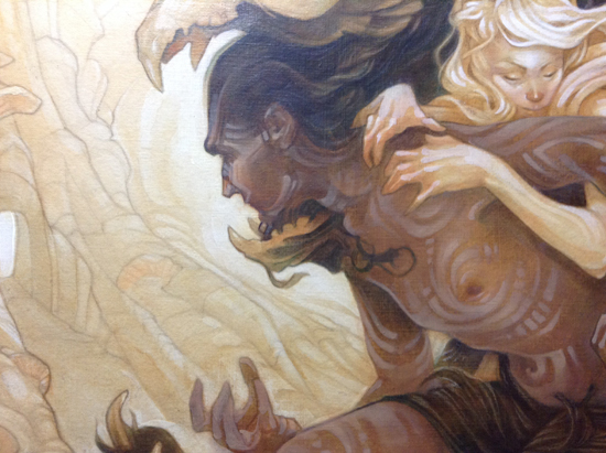
From there, it was just a matter of letting the initial glaze dry, then selectively deepening the dark values, adding tints, and working in touches of opaque white to pop the highlights. Probably the most time-consuming part of this stage was Tam Lin's skin - I have a pretty good handle on painting super pale skin, which is easy (beige paper + pink glazes and white highlights = finished!) but I wasn't sure how to handle darker tones - especially since I wanted to include some sort of woad/scar/tattoo patterns. I ended up going a lot more opaque than I would have liked; I think in the future I'll start rendering darker skin at the acrylic ink stage and borrow some techniques from watercolor artists to maintain a transparent look.
(Materials: Walnut oil; oil paint in Raw Umber, Phthalo Blue, Indian Yellow, Permanent Alizarin Crimson, and Titanium White; Turpenoid Natural; blue "shop" paper towels)
IN CONCLUSION...
All in all, this piece took about 20 hours of drawing and 40 hours of painting to finish - a bit more time than I'll generally spend on a digital painting, but not an enormous difference. Filming the painting process slowed me down considerably (I have a newfound respect for people who produce their own art videos).
Before I started, I kind of wondered if it would be worth repainting an old piece, but in the end I'm glad I did - I'm quite happy with the finished painting (which is enjoying its run as my Favorite Piece Ever) and as a primarily digital artist, it's novel to have a tangible, real-world piece of art to show for all the effort.
If you want to follow my twisted experiments (and check out tons more process tutorials) you can support my art on Patreon, link below: