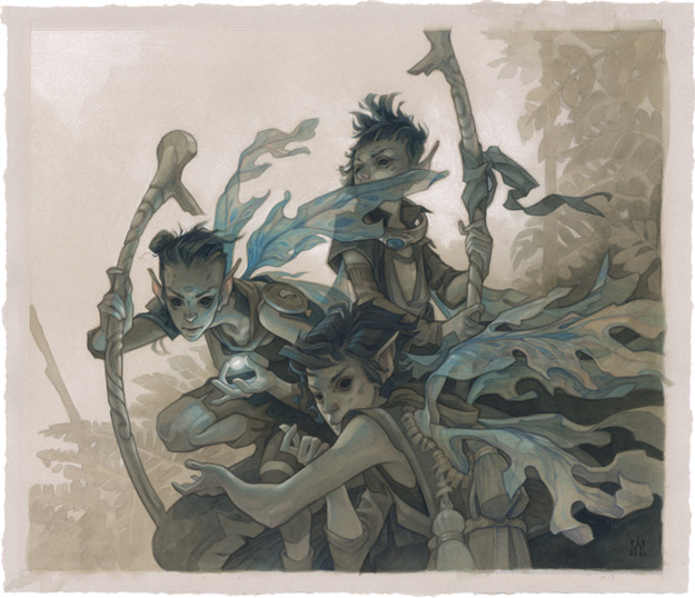
FOLLOW/SUPPORT
![]()
![]()
![]()
![]()
CONTACT: [email protected]
![]() JOIN THE MAILING LIST
JOIN THE MAILING LIST
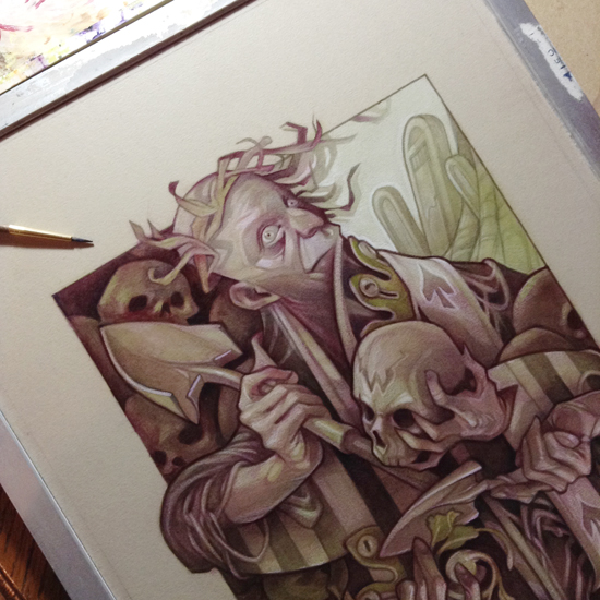
King of Spades
Oil Painting Process
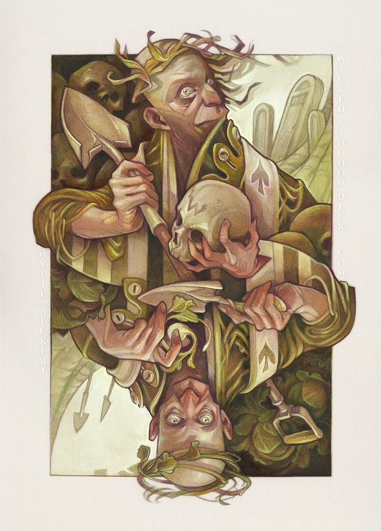
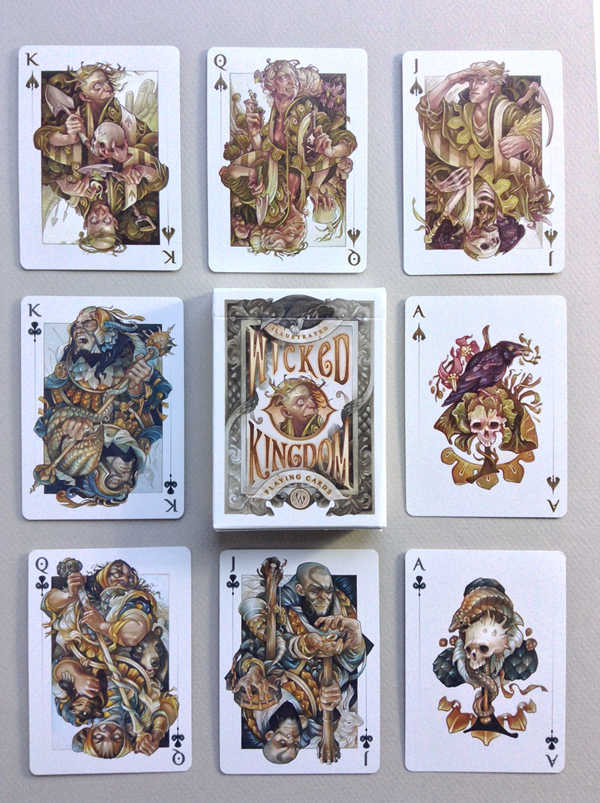
The King of Spades is my first illustration for Wicked Kingdom, a series of traditionally-painted playing card illustrations. You can buy the finished deck in my shop HERE.
For some in-depth info on the creation of this painting, keep reading! All of my process tutorials are made possible by my patrons on Patreon. Your support helps keep the tutorials coming - sign up below!
I. INSPIRATION/IDEATION
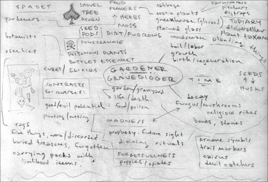
[Most of my illustrations begin with written notes.]
Since it's easy to get attached to a particular sketch at the early stages of a piece (which can be limiting), I prefer to hammer out my ideas in writing BEFORE I start drawing. It saves time, and it lets me explore (and discard) a wide variety of possible directions.
My main source of inspiration here was the Spade symbol – it made me think that the characters in this suit would have to be botanists, gardeners, or otherwise involved with plants. Asking further questions on this concept (why would a king stoop to being a gardener?) informed other aspects of the character (the King of Spades has let his kingdom fall by the wayside, and has turned instead to caring for his garden). By looking for parallels and contrasts (what other occupations could involve working in the dirt? What might be the opposite of bringing life out of the ground?) I hit on the idea for the other half of the character's dual identity: a gravedigger. Doing some general brainstorming brought up some possible elements to include in my painting (types of plants, themes to consider). My notes include some directions that didn't pan out, but that might come in handy for planning the rest of the Spades suit.
II. THUMBNAIL CONCEPT
[Materials used: Strathmore Toned Gray, HB mechanical pencil, General's white charcoal pencil.]
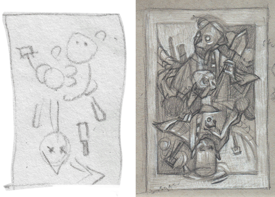
The ideation process above helped me narrow down the essentials I wanted to include in my image to get the message across (two opposing versions of the same character; cabbages, skulls, tombstones, and shovels.) I try to visualize the layout before putting pencil to paper; an extremely rough, not-even-stick-figure thumbnail (above left) lets me double check that everything will fit properly into a rectangular page.
Working slightly larger (around 3x5”, above right) I begin to flesh out the idea. At this stage, my primary concerns are composition (ensuring that the image is balanced) and values (making sure the darkest and lightest areas draw the eye to the focal points) - using a mid-toned paper along with dark and light pencils lets me plan my image in a three-value system from the very beginning.
III. reference photos
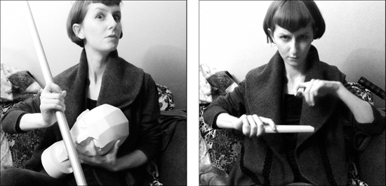
Using my finished thumbnail sketch as a guide, I take a few reference photos. Since there's a fairly large imaginative component to my character art (I'm not trying for photorealism), my reference isn't anything too elaborate – I'm mostly just trying to get a handle on the pose, lighting, and other details that can be tricky to create from scratch. This allows for a certain amount of invention at the sketch stage, while still giving me something concrete to check my drawing against.
IV. ROUGH SKETCH
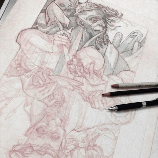
[Materials used: lightbox, Strathmore 300 Bristol (surface: Vellum), Col-Erase pencil (Tuscan Red)]
I scan and enlarge my thumbnail to its final size, print it out, and use a lightbox to transfer the rough layout to a sheet of Bristol paper. From there, I work out the rest of the drawing freehand, referring back to my reference photos for any details I'm not certain of.
Since I do a lot of tweaking and refining as I draw, I use a red Col-Erase pencil (and a light hand) for the initial sketch – it allows for a relatively clean final drawing despite a great deal of reworking, and the colored lines can be easily removed in Photoshop if desired.
V. FINAL PENCIL ART & GICLEE PRINT
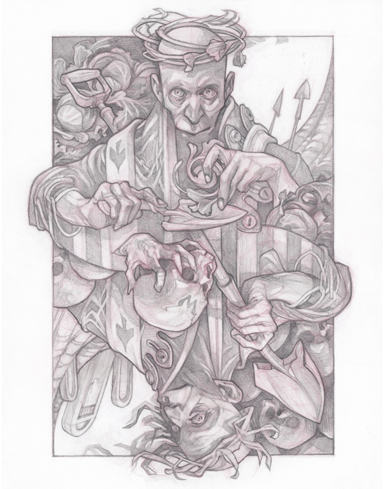
[Materials used: 2mm HB drafting pencil, .5 and .3mm mechanical pencils, kneaded erasers, Faber-Castell
Perfection eraser pencils, chamois for blending, Canson Mi-Teintes pastel paper (color: Pearl), paper stretcher]
Once I've nailed down the sketch in red pencil, I go back in with standard graphite pencils for the final rendering. Rather than working against pencil's tendency to smudge, I use a piece of chamois cloth to blend the marks as I go for a soft, even midtone that can be picked out with an eraser or enhanced with a heavier application of pencils. Kneaded erasers are my main tool here, although eraser pencils are great for details and fine lines.
At this stage, I transfer my sketch to a sheet of tinted pastel paper. To save myself more tedious transferring (and because tinted paper doesn't play well with a lightbox), I have a giclee print made of my drawing on the final surface at a local print shop.
Since my paper is fairly thin and I'll be using water media on it, pre-stretching is necessary to prevent buckling. I spray both sides of the sheet with water and let it sit on a flat surface for a few minutes to expand fully, then secure it to my homemade paper stretcher. In theory, almost any stretching method normally used for watercolor paper should work here (stapling, taping, etc) but I've found using a paper stretcher to be faster, neater, and more reliable.
VI. Watercolor & ACRYLIC INK
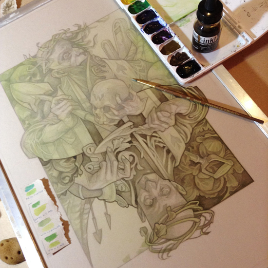
[Materials used: watercolors (Phthalo Blue, Cadmium Yellow), large flat brush, sea sponges,
Liquitex acrylic ink (Transparent Raw Umber & Black), small round brushes]
I want the finished painting to have a greenish-yellow color scheme, so the initial light wash is a mix of Phthalo Blue and Cadmium Yellow. I coat the entire surface – less the background, which I'm keeping blank – then use a damp sea sponge to draw the color away from areas that I want to have a more neutral tone (in this case, the faces and hands). There's no need to be too precise here – the watercolor dries quite light on the tinted paper I'm using, and there will be plenty of opportunity to push the colors one way or another in subsequent stages.
Once the watercolor is dry, I use acrylic ink (a 5:1 mix of Transparent Raw Umber and Black) to trace the major outlines and start building up the areas of darkest value. I use a very light hand (and dilute the ink liberally with water) when working on the facial features, since I want to keep the tones soft and aim for a more naturalistic, less graphic style here.
VII. White charcoal pencil
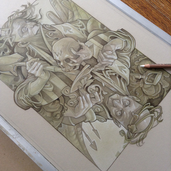
[Materials used: General's white charcoal pencil, chamois for blending]
This is probably the my favorite stage – sculpting the forms with white charcoal pencil. I start to build up the lightest values, referring back to my reference photos to remind myself of the lighting and details. For large areas of flat white, blending with a chamois or a piece of tissue can help build even tone; however, I try to keep most of the white charcoal shading unblended – sharper lines will show more clearly through subsequent layers of paint, and add an attractive texture to the final image.
IIX. Sealing with spray matte medium
Before I go any further, I seal the watercolor/white charcoal layers. I've found that conventional spray fixatives aren't strong enough to take much overpainting (and can sometimes dissolve white charcoal all on their own), so instead I use matte medium, diluted by half with water, in a small spray bottle. Three light coats (a very fine misting, allowed to dry between coats) seems to be the magic number.
IX. Watercolor tints
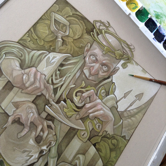
[Materials used: watercolors (Phthalo Blue, Cadmium Yellow, Cadmium Red), small filbert brush]
I finish out the underpainting with a few washes of saturated watercolor – bright greens for the cloak and foliage, and touches of red to add life to the skin tones. It's important to note that watercolor will act differently when applied over matte medium; I've found that using fairly dry washes and scrubbing the color into the surface with a small brush helps counteract this. Once finished, I seal with another three coats of spray matte medium to set the watercolor, and another three coats (brushed on and allowed to dry thoroughly) to ensure that the paper will be completely protected from the oil paint and solvent to come.
X. Oil base tone
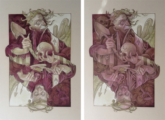
[Materials used: oil paint (Permanent Alizarin Crimson, Ultramarine Blue), walnut oil, large flat brush]
I start with a layer of darker oil paint in a single color to deepen the values.To avoid a monochromatic look, I chose a contrasting reddish-purple tone to offset the greenish-yellow underpainting, and a little bit of walnut oil to help the paint spread more easily. Using a large flat brush, I scrub a layer of paint over all but the lightest areas of the painting, then blend lightly with a blue paper towel to remove excess paint, soften edges, and create a uniform base tone. I try to keep the paint away from the absolute lightest values, but I do allow a tiny amount of color to blend into the face and hands.
XI. Oil RUB-OUT
[Materials used: Turpenoid natural, small filbert brush, Q-tips, blue paper towels]
Using a small filbert brush dipped in solvent, I scrub the oil paint out of the light areas. For the very brightest highlights, I use a Q-tip, which seems to pick up more pigment than a brush. Because I don't want to compromise the matte medium layer, I immediately dab up any excess solvent with a paper towel.
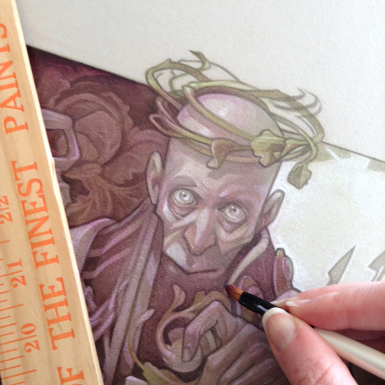
XII. Oil Details
[Materials used: oil paint (Permanent Alizarin Crimson, Ultramarine Blue), walnut oil, small round brush]
With a small brush, I use the same paint I mixed for the base tone to build up the darkest areas, touch up outlines, and enhance any tiny details that may have gotten lost in the base tone. I allow this layer to dry completely (at least a few days) before moving on – if a paper towel rubbed on the surface picks up any pigment, the surface isn't dry enough to take additional oil work without lifting.
XII. Oil Glazes
[Materials used: oil paint (Prussian Blue, Indian Yellow), walnut oil, small filbert brushes]
I mix a bright greenish-yellow hue, thin it with walnut oil, and brush it over the dried base tone to bring some saturation to the cloak and foliage. I leave the areas that I want to remain neutral-colored (skin, metal, etc) untouched.
XIII. Opaque highlights

[Materials used: oil paint (Titanium White), walnut oil, small round brushes]
While the layer of glazes is still wet, I use tiny brushes to paint my highlights into the glaze with a blend of white paint and walnut oil.
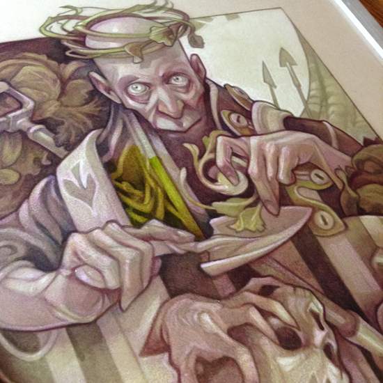
XIV. FINAL GLAZE
[Materials used: oil paint (Indian Yellow), walnut oil, medium flat brush]
I let the previous layers dry completely before assessing the results. For this piece, I found that the purple base tone was coming through a little too strongly in the skin tones. I added one final, very thin yellow glaze to knock back the purple hue and unify the color scheme.
It's finished!!